From our previous data exploration article, we remembered why data quality is so important in any data investigation from looking at how sparse the data was. The sparse data issue, which was revealed by our visuals, prompted us to ask several questions about the gaps in the data collection and analysis. So, in this article, we will be taking a step forward in our attempt to close those gaps and find some answers by using heatmaps to zoom in to the limited data we have.
Notes about this work
- Data on the number of passengers were collected at entries and during trips.
- The day groups were determined as 1. school days (Mondays to Fridays with school), 2. school holidays (Mondays to Fridays with school holidays), 3. Saturdays as well as 4. Sundays and public holidays.
- Mean entries and occupancies for each day group were calculated using the Pandas groupby [arithmetic] mean method, (Statistics How To listed the various types of means that can be calculated for different types of data sets).
- The mean values were calculated for 2 main reasons. 1. Calculating the mean of all the values can replace the missing values in the set (assuming the sparsity is low); 2. The entries and occupancies will not always be exactly the same for each line at every hour on each day for each day group. So the mean values can give us a rough idea of the entries and occupancies for all the lines.
- We used heatmaps because they helped us depict 3 dimensions for each day group, i.e., hours of the day on the x-axis, lines on the y-axis and number of passengers via the colour spectrum.
- Different colour codes were applied for different target values: Pink for passengers boarding (entries) and green for people on board (occupancies).
- The colour spectrum scale for all heatmaps of each target value were standardised.
- The lines were sorted from lowest number to highest number.
- The line names remain as random numbers for anonymity.
- Several iterations of coding was executed to make the heatmaps shown below as presentable as possible.
School days
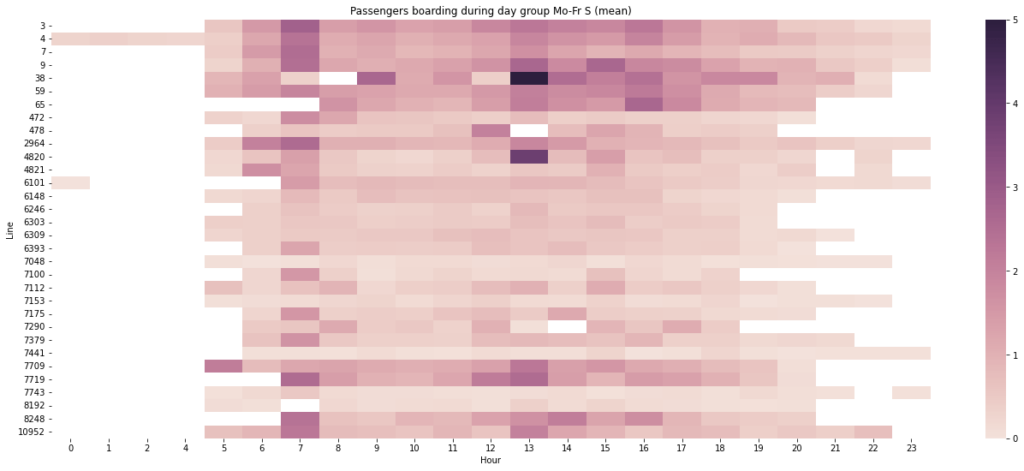
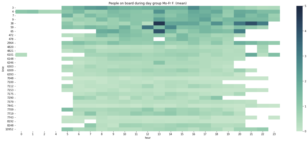
- Certain lines like Lines 3, 4, 7, 9, 38, 59, 65, 2964, 4820, 7709, 7719, 8248 and 10952 have higher mean entry levels than other lines over the entire day. This is maybe because they are near the busier areas that are part of important routes for daily needs like work, school and errands. This is an important indicator of a routine-centric society.
- Line 38 at 1pm holds the highest mean entry level out of all the lines at all hours. Maybe Line 38 is part of an interchange station or just happens to host the after-school and work lunch crowd.
- However, Line 38’s morning rush hour is at 9am, 2 hours after the morning rush hour for most other lines.
- Most of these lines have peak mean entry levels at around 7am and 1pm, which can be linked to the start and end of the school hours. A similar conclusion can also be made about the rush hours for the working crowd in the mornings and early evenings, each with a wider spread of passengers over a few hours (like 5am-9am).
- The concentration of peak mean entry levels in very few hour slots could mean that many of the school students are lining up at bus stops to enter the buses or that those hour slots are when the buses are making their rounds to fetch and drop students.
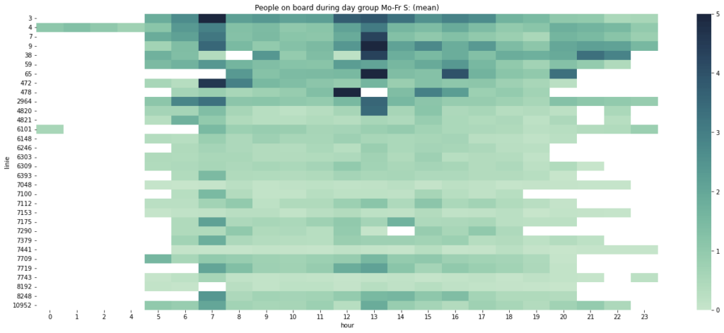
- Compared to the mean entries, mean occupancies are generally higher (shown by a higher frequency of darker shaded boxes), especially for 7am-Line 3, 1pm-Line 7, 1pm-Line 9, 1pm-Line 38, 1pm-Line 65, 7am-Line 472 and 12pm-Line 478, because it reflects the accumulation of passengers inside the bus after they enter the bus and before they exit the bus.
- The peak mean occupancy levels are still in the mornings and afternoons, also indicating the number of students sitting in the buses as they go to school in the mornings and back from school in the afternoons.
- As indicated in the heatmaps for both mean entries and mean occupancies, a few lines like Lines 7048, 7153, 7441, 7743 and 8192 show very low levels, which could mean that they’re low-demand lines for school and work.
- There are 5 empty boxes in these heatmaps that can be seen on school days: 8am-Line 38, 1pm-Line 478, 2pm-Line 7290, 7am-Line 8192 and 9pm-Lines 4820 and 4821. These lines at these times either have no one entering and sitting or are not in service.
- Some of the lines show that some people still enter and sit in the bus very late at night. These passengers using the night service could be workers with nocturnal shifts and people who enjoy being outside until their parents or children fall into deep sleep.
School holidays
By checking the data on school holidays, we can eliminate the school-going crowd from the weekday data to see how things are like for the working crowd.
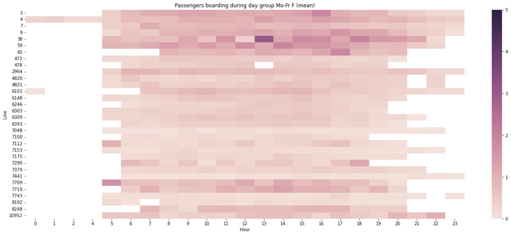
- Overall, there are less dark shades in these school holiday heatmaps, reflecting the absence of demand for school transport.
- Line 38 at 1pm still holds the highest mean entry and even occupancy level, which narrows down our possibilities to the work lunch crowd and interchange station. Or something else.
- Lines 3, 4, 7, 9, 38, 59, 65, 7709, 7719, 8248 and 10952 still have higher mean entry levels than other lines. But lines 3-65 seem to show higher mean occupancies than lines 7709-10952. The occupancies of the latter lines don’t seem to reflect the accumulation of entries like the former lines do. Perhaps the exits for the latter lines equated the entries, so there’s some sort of low net occupancy?
- Two boxes that were empty on school days at 8am-Line 38 and 2pm-Line 7290 are no longer empty on school holidays (though 1pm-Line 478, 7am-Line 8192 and 9pm-Lines 4820 and 4821 remain empty). Maybe they’re leisure trips for the students enjoying their days off.
- The same lines with night service are still business as usual during school holidays.
- The wide distribution of mean entries and occupancies for both school days and school holidays on the weekdays indicate that public transport is definitely essential on the weekdays.
Saturdays
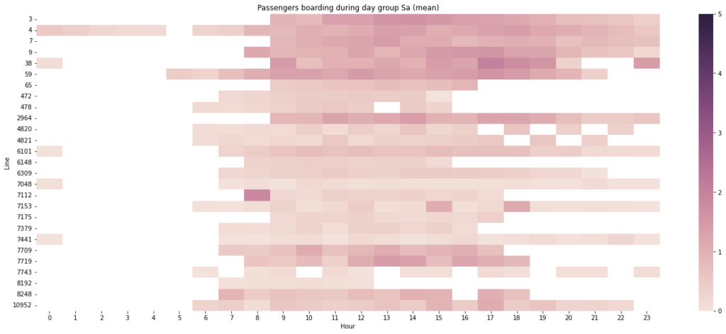
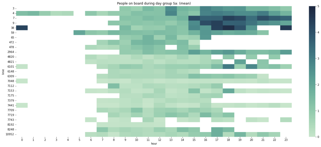
- Compared to the weekdays, the distribution shape of the heatmaps for Saturdays has changed.
- While some people want to rise and shine very early in the morning (maybe to hike) or are still on the way home from a long Friday night out, most people just want to sleep in since there’s no incentive for them to wake up and commute earlier on Saturdays, another indication of being routine-centric.
- For some lines, people also stop travelling at night (at least not by public transport). Meanwhile, other lines seem to be active until midnight.
- Line 38’s night service peaks on Saturdays. Maybe it’s situated near the really fun Saturday night districts.
- Compared to the weekdays, Line 4 has a service gap at 5am.
- A lot of passengers enter and use Line 7112 at 8am.
- Some lines do not have passengers after a certain time. Examples: Nothing after 12pm for lines 7743 and 8192, after 3pm for lines 472, 478 and 6148, and after 4pm for lines 65 and 7379. Maybe these lines are not for Saturday evenings or the operator is redirecting passengers to other lines to cut costs.
- Other times, many of these trips could be leisure and activity trips if not work trips for workers with weekend shifts.
- Lines 3, 4, 7, 9, 38, 59, 7709, 7719, 8248 and 10952 are still high in demand on Saturdays. These lines could be near the city centre, maybe even a part of the hustle and bustle of the city among other purposes.
- There also seems to be a basketweave-like visual on Lines 4820 and 4821 from 5pm to 10pm. If these two lines are connected to each other, maybe they’re designed to alternate their operating hours in the evenings to optimise resources.
Sundays and Public holidays
We put Sundays and public holidays in the same day group because they’ll still show the same patterns if they were analysed separately. As we can see in the heatmaps below, this is mainly due to the nationwide pro-labour norm of closing shops on Sundays and public holidays, which many of you who grew up in consumerist societies would be surprised to know about.
Understandably, this is contrary to the idea that Saturdays, Sundays and public holidays are the best days to catch up with errands, fulfil the occasional shopping list and hang out at the mall if not for proper rest, fun and relationships.
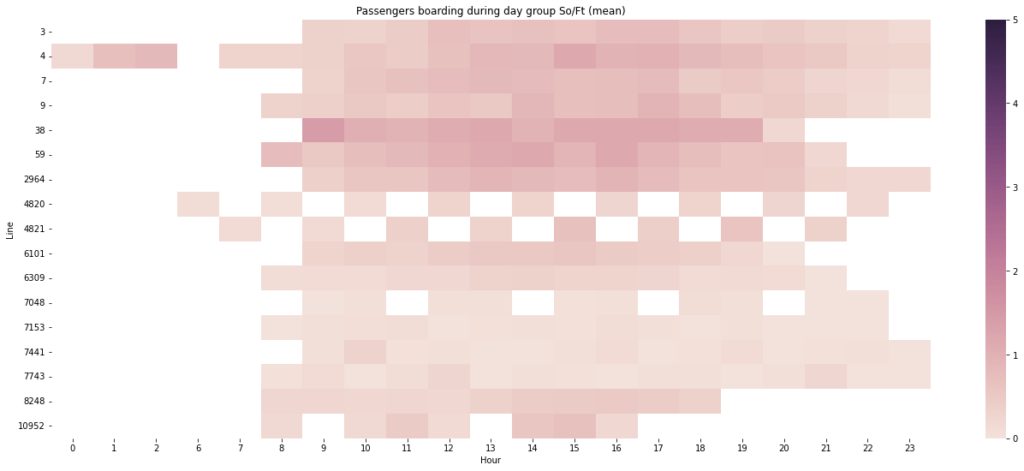
- The distribution shape of the heatmaps for Sundays and public holidays has changed again. This time, we have fewer lines visualised and the x-axis scale skips from 2am to 6am, which could mean that the other lines and the hours between 2am and 6am are empty, not operating or lack data in this day group.
- Most of the lines (except Line 10952) visualised in these heatmaps show that they have passengers pretty much the whole day from 8am or 9am, unlike Saturdays when several lines do not have passengers after certain times in the afternoon.
- Again, a basketweave-like visual on Lines 4820 and 4821 can still be seen, but it’s for a whole day (morning to night).
- Line 7048 is also showing an interesting pattern of empty boxes at 11am, 2pm, 5pm and 8pm.
- Lines 7, 38 and 59 seem to be the more popular choices of lines every day. This confirms that they’re connected to many things that matter to the masses, beyond work and school.
- One of the things that remains constant in all cases is that Line 4 always has passengers past midnight. Maybe in anticipation of another day off the following day, these passengers have their night out the night before.
- On Sundays and public holidays, Line 4 has a service gap at 6am.

What did our heatmaps reveal about our public transport people counting data?
In our attempt to close the gaps we found in our previous article, we collected entry and occupancy data of all the lines in our data set during school days, school holidays, Saturdays as well as Sundays and public holidays.
We calculated the Pandas groupby means of the entry and occupancy values for each day group to replace the missing values (this is actually mean imputation) and to get a rough idea of the entries and occupancies for all the lines. However, we have to wonder if it was a mistake to do the mean imputation or not.
Then, we visualised these values on heatmaps to interpret them. From our interpretation, we made several assumptions, including one that reminded us of the universal weekday routine for work and school as well as the weekend routine for leisure. And another one that would have given many of you a culture shock.
Here’s a recap of the assumptions we made in this article.
Why did mean occupancy heatmaps have deeper coloured boxes than mean entry heatmaps?
What were the signs of a weekday routine-centric society in the heatmaps?
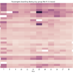
Many lines with higher mean entry and occupancy levels than other lines could be integral to the routine-centric society for work, school, errands, lunch and interchanging to other lines.
On school days, most of the lines have peak mean entry and occupancy levels concentrated at around 7am and 1pm which can be linked to the school transport hours.
On school holidays, the absence of school transport demand decreased the overall demand for public transport, giving space to the non-school crowd.
The wide distribution of mean entries and occupancies for both school days and school holidays on the weekdays indicate that public transport is definitely essential on the weekdays.
The heatmaps also showed lines with night service.
How did the public transport heatmaps differ between weekdays and weekends?
Why were fewer lines and hours visualised on Sundays and public holidays?
What could the few empty boxes in the heatmaps mean?
With all that said, we shall seek to find out more in the next people counting data exploration article.

